Designing a modern identity for traditional chai
Client
Tea Sense - A Premium Tea
Year
2025
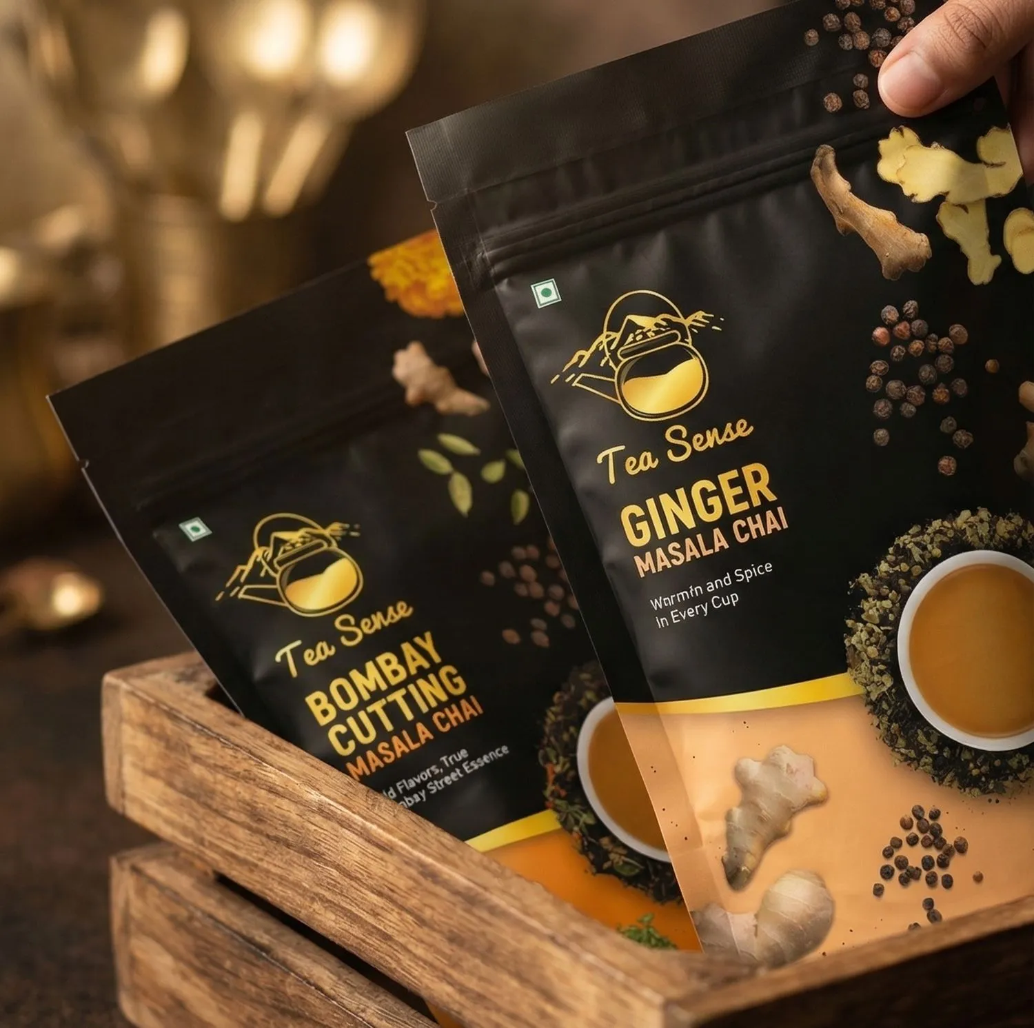
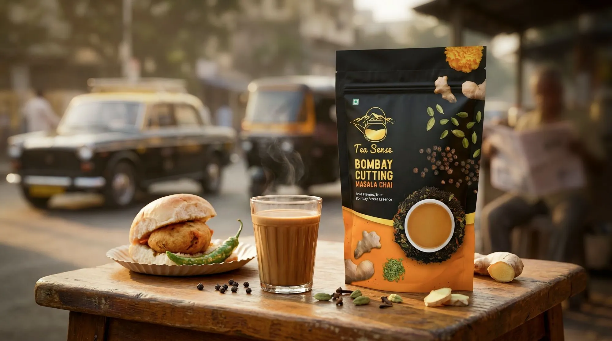
Tea Sense is built around the idea of bringing authentic Indian chai into a modern, well-structured visual system. The goal was to create packaging that feels rich, warm, and instantly relatable.
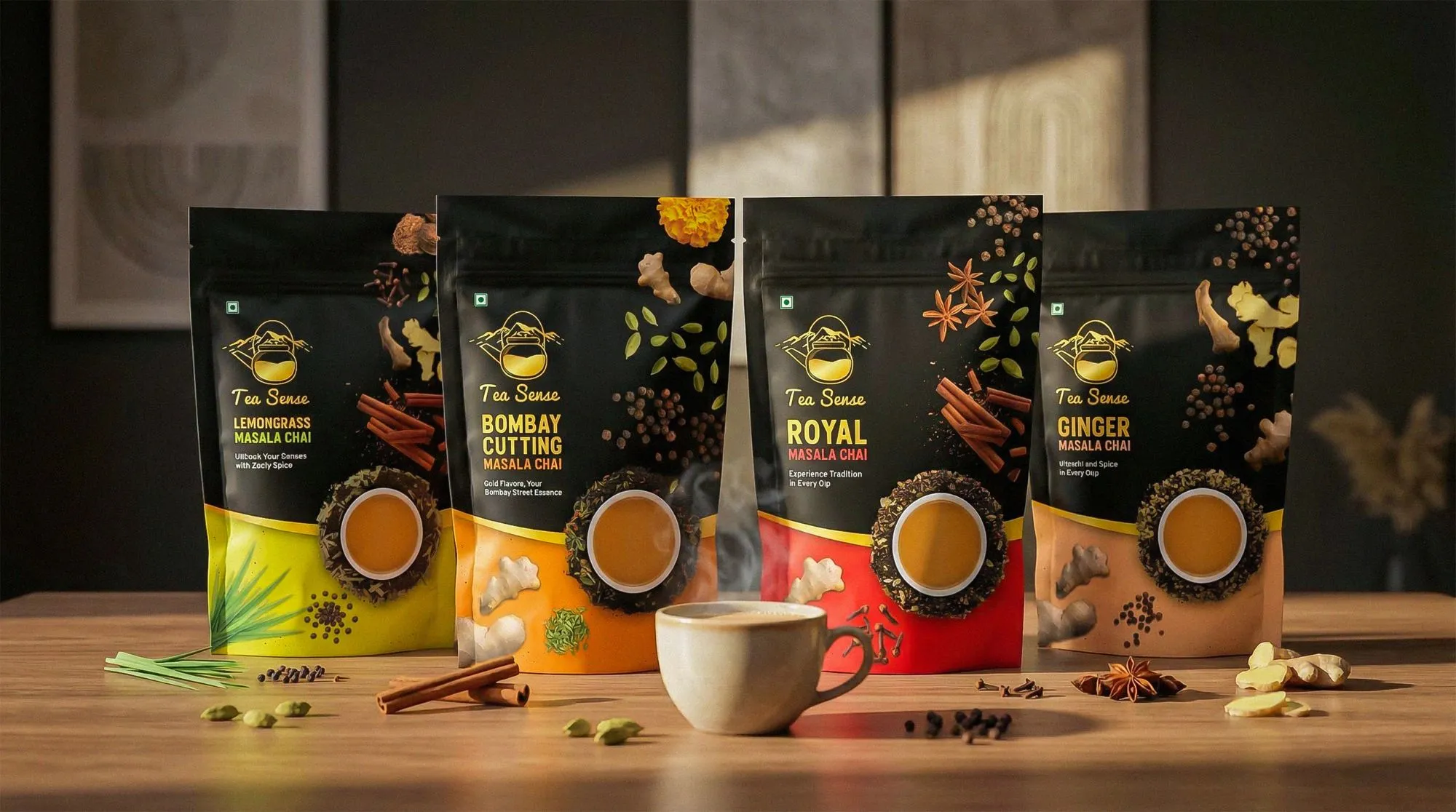
The design blends deep tones with vibrant accents to reflect different flavors while keeping a strong and consistent identity. Real ingredients and minimal text help communicate the product clearly and naturally.
The result is a packaging system that feels traditional at heart, but clean, premium, and relevant for today’s audience.
Scope of Work
Objective
To design a premium and scalable packaging system that reflects the richness and authenticity of Indian chai while feeling modern and relevant. The focus was on creating a balance between tradition and a clean, structured visual approach that works across different variants.
Goal
To build a strong and memorable identity using bold contrast, clear layouts, and a consistent system. The design communicates flavor through visuals instead of heavy text, improves shelf visibility, and ensures every pack feels connected while still standing out.
Target Audience
The target audience includes young adults, working professionals, and families who value authentic taste with a premium experience. They are drawn to products that feel familiar yet refined, and appreciate packaging that looks appealing, clear, and easy to trust.

Design Direction
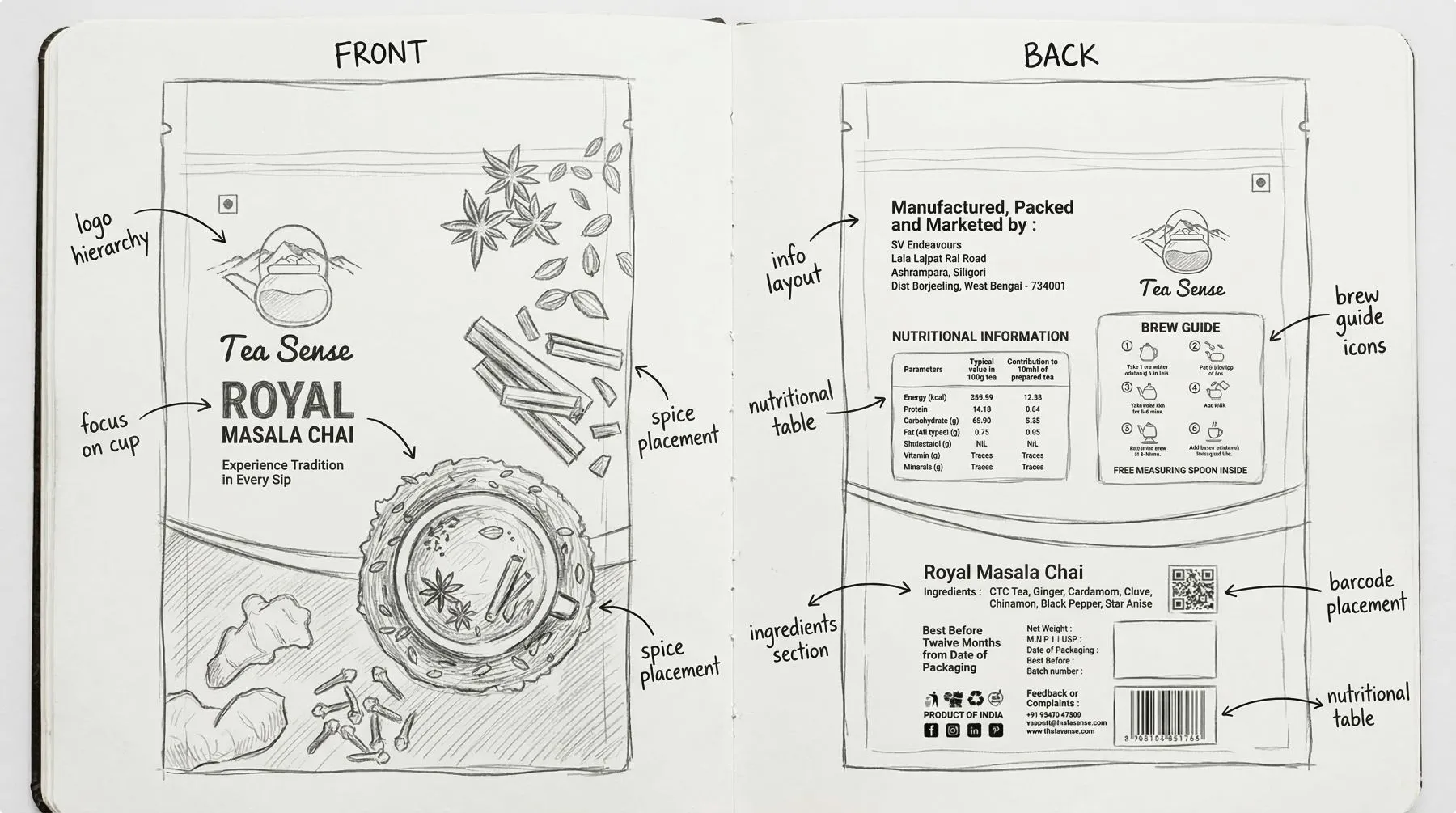
The design is inspired by the richness of Indian spices and the contrast between tradition and modern aesthetics. It uses deep backgrounds, vibrant flavor-based accents, realistic ingredient visuals, and clean typography to create a bold and immersive look. The direction balances familiarity with a premium, structured feel to ensure strong shelf presence.
Each variant is crafted to reflect a distinct flavor and mood. Instead of relying on heavy text, ingredients are used as visual storytelling elements to create an instant connection. The tea cup represents the final experience, while the surrounding elements build anticipation and bring the product to life.