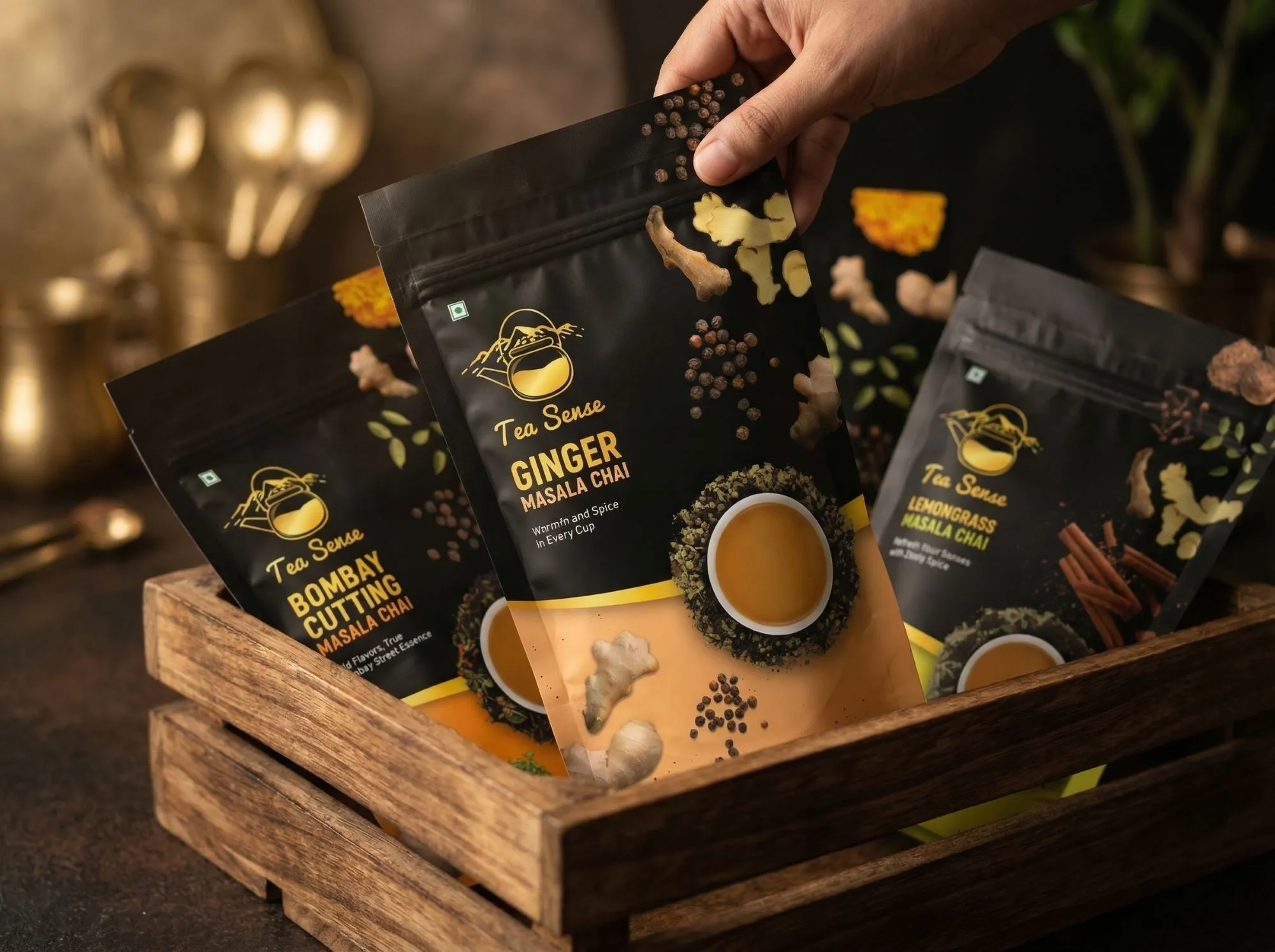
A Fresh and Vibrant Packaging Design
Client
Fruit Blends
Year
2026
PurePulse is a health-focused product designed for a modern, everyday lifestyle. The goal was to create a packaging system that feels fresh, clear, and easy to recognize.
The focus was on combining strong visual appeal with simplicity, so each flavor stands out while still feeling part of one system. Every element was designed to communicate freshness, and energy
The result is a clean and flexible packaging system that works across multiple variants while staying consistent and easy to understand.
Scope of Work

Objective
To design a fresh and vibrant packaging system that reflects natural ingredients while creating strong visual appeal and instant shelf recognition.
The Goal
To build a clean and refreshing identity, using bold yet natural color systems to highlight flavors, communicate benefits clearly, and maintain consistency across multiple SKUs while keeping a modern, health-focused feel.

Target Audience
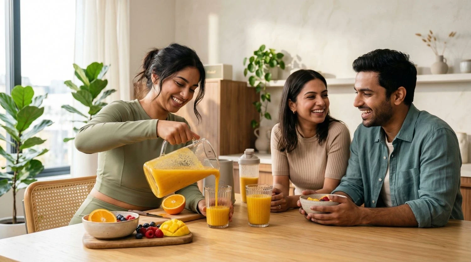
The target audience includes young, urban consumers who prefer convenient nutrition, fast-paced lifestyles, and clean visual aesthetics, while still expecting products to feel energetic, functional, and premium in everyday use.
Design Direction
The design direction is inspired by freshness, energy, and simplicity, aiming to create a system that feels clean yet visually engaging. It uses bright, flavor-driven color palettes to instantly communicate taste, combined with minimal but bold typography that ensures clarity and strong shelf presence. Realistic fruit cues help with quick recognition, while soft gradients and smooth transitions enhance the sense of freshness and fluidity across the design.
The overall approach balances playfulness with clarity, making the product feel both approachable and premium at the same time. Every element is thoughtfully designed to evoke a sense of freshness, energy, and simplicity, while also fitting naturally into everyday routines. The result is a design that feels modern, lively, and easy to connect with at a glance.